Horský domov (‘Mountain Home’) is a charming chalet-hotel nestled in the stunning Giant Mountains, or Krkonoše, the largest mountain range in the Czech Republic. The establishment is just a few steps away from a beautiful national park and in close proximity to Sněžka, Czechia’s tallest mountain.
As if that wasn’t enough, the managers of Horský domov, Ben and Olinka, are passionate foodies, and the hotel menu has become something of a legend.
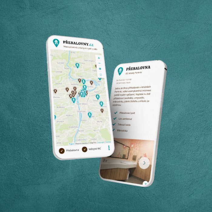
The hotel’s new bilingual website showcases accommodation options and highlights Horský domov’s premium services.

Website brief
Horský domov’s original website hadn’t been updated for several years. At the start of 2024, the managers renovated a new building and decided to use this opportunity to give the website a makeover. They needed an up-to-date online presence that would showcase all the currently available accommodation options.
Ben and Olinka wanted something ‘simple and light,’ perhaps even a single-page website. However, it quickly became apparent that Horský domov offers so much that it was simply impossible to fit it all into just one page
UX research and websites: What people want to know
‘We’ve got a section on our website that lists things people can do around here,’ Ben told me on one call. ‘You know, like activities, day trips and the like. Do you think anyone actually cares?’
‘I’ve no idea,’ I said. ‘But I’ll find out.’
How? Through UX research and analysis.
I set out to discover what exactly visitors look for when they fire up a hotel website. I did some research, conducted several interviews, and prepared a questionnaire, which was filled out by 39 respondents. I also asked the client if there were any questions or issues that frequently came up – any misunderstandings happening on a regular basis? If yes, could they be avoided by including appropriate content on the new website?
My research showed that people visit hotel websites to learn as much as possible about the establishment and to prevent awkward surprises. Visitors look for the price, accommodation options, and basically every single detail they can find. Oh, and they also want to be able to book their stay immediately.
Guided by what I learned in my research, I drafted the first version of the website structure (information architecture). I listed all the individual pages the website should include and made a note of the type of information visitors expect to find on them.
The client’s feedback let to some alterations. For instance, Ben and Olinka didn’t want a booking system, because they wanted to have a say in who books what and when. They didn’t want an elderly peace-loving couple accidentally booking a stay at the same time as a group of rowdy schoolchildren :).
So I edited the site map accordingly – and started working on the website itself.

Visual identity
Horský domov already had an amazing logo created by a professional graphic designer. I use their brand colours – a vivid green and darker blue – as a basis for the website’s colour palette, and the logo also inspired several elements in the website design (e.g. stylised sketches of sheep, clouds, and houses, all on the backdrop of the Giant Mountains).
The brand kit didn’t cover typography, so I selected two fonts for the websites. The first, Josefin Sans, was inspired by the signs in the hotel; the second, Shadows into Light 2, looked very much like Olinka’s handwriting (in which she writes the menu daily on a chalkboard in the dining area).
Finally, the client also provided a vast selection of photos.
Website design? It depends
At this point in the website design process, I start working on the website itself. I adapt the process to individual projects, though. Sometimes – often when working with artists – I make several static homepage designs, at other times I start building the website immediately (generally when the client wants to see the website in action, had very specific design requirements, or even provided the design themselves).
In the case of Horský doom, I started by developing the homepage. Then I sent it off for feedback.

Website copywriting
Generally, when I create a website, the client provides the copy, and this project was to be no exception. In the end, however, we decided that I will write the copy myself.
I drew on the texts of the original website and three hour-long calls with Olinka. Armed with all the details I needed to know to get the work done, I set out to write the copy.
Website development
As soon as the client approved the homepage design (there was a lot of back-and-forth about the hero photograph), I created the rest of the website and sent it off – once again 🙂 – for feedback.
I develop websites on a special URL address that the client has access to. I only move the website to the client’s domain after everything has been approved.
Ben and Olinka edited the website copy slightly (‘So it sounds more like us!’), went over the website, consulted it with a few acquaintances, and changed a few pictures here and there.
Translation
Although the majority of the hotel’s visitors are Czech, once in a while there’s a guest who doesn’t speak the language. We decided to add an English version to the website. The copy was localised by Klára Sýkorová, and I refined the headings to make them shorter (so they would fit on the website better).

Post launch
And then, suddenly, the website was finished and launched.
Ben and Olinka wanted to be able to edit the website content themselves, so I created a series of video tutorials for them. In addition, when they update the prices, they do it only in one place, which the rates updating themselves automatically in all the separate pricing tables throughout the website.
I added plugins that protect the website from cyber attacks, improve its loading speed and optimise it for search engines (SEO). Finally, I also handle ongoing website maintenance.